tt bakers
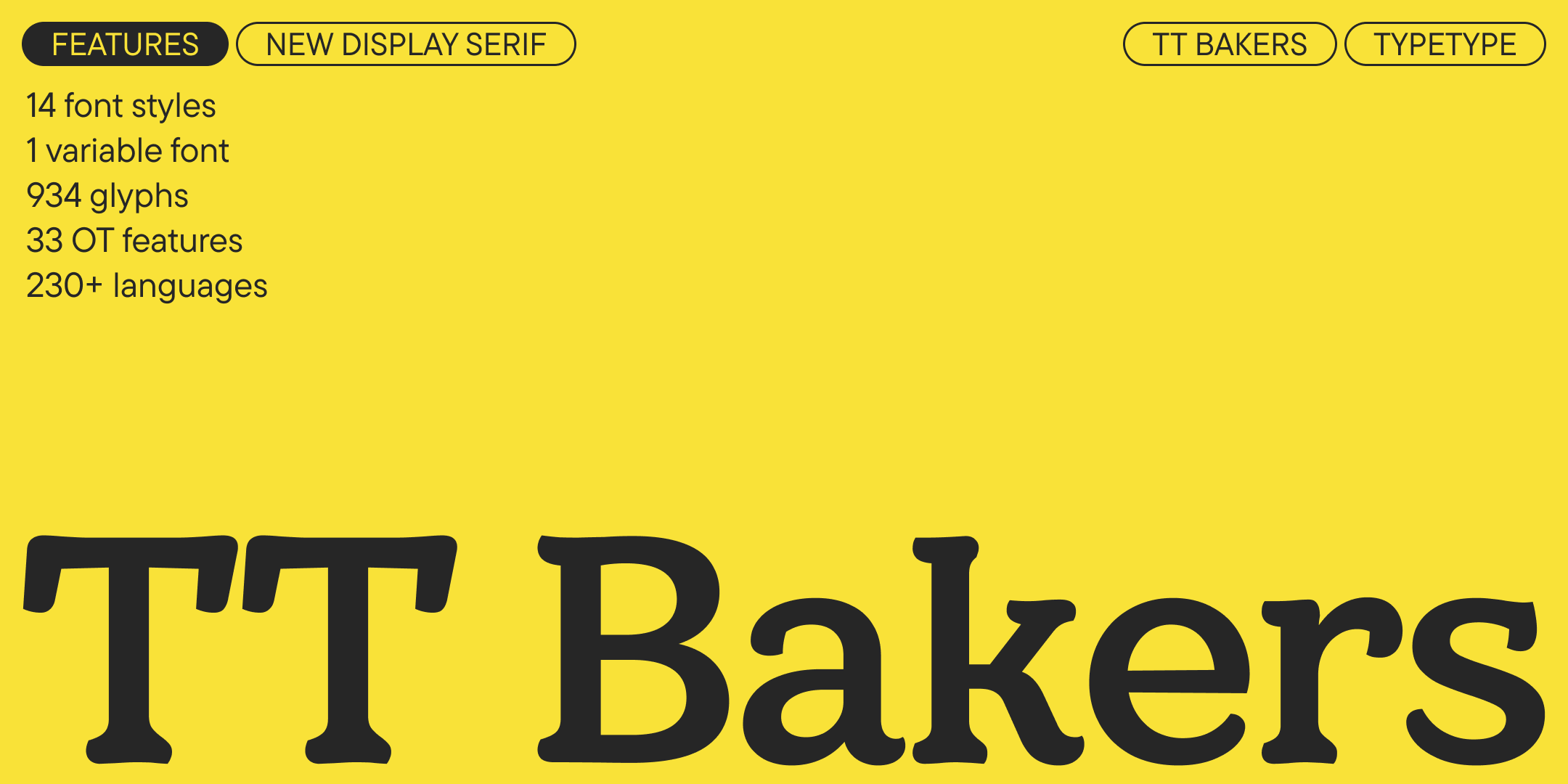
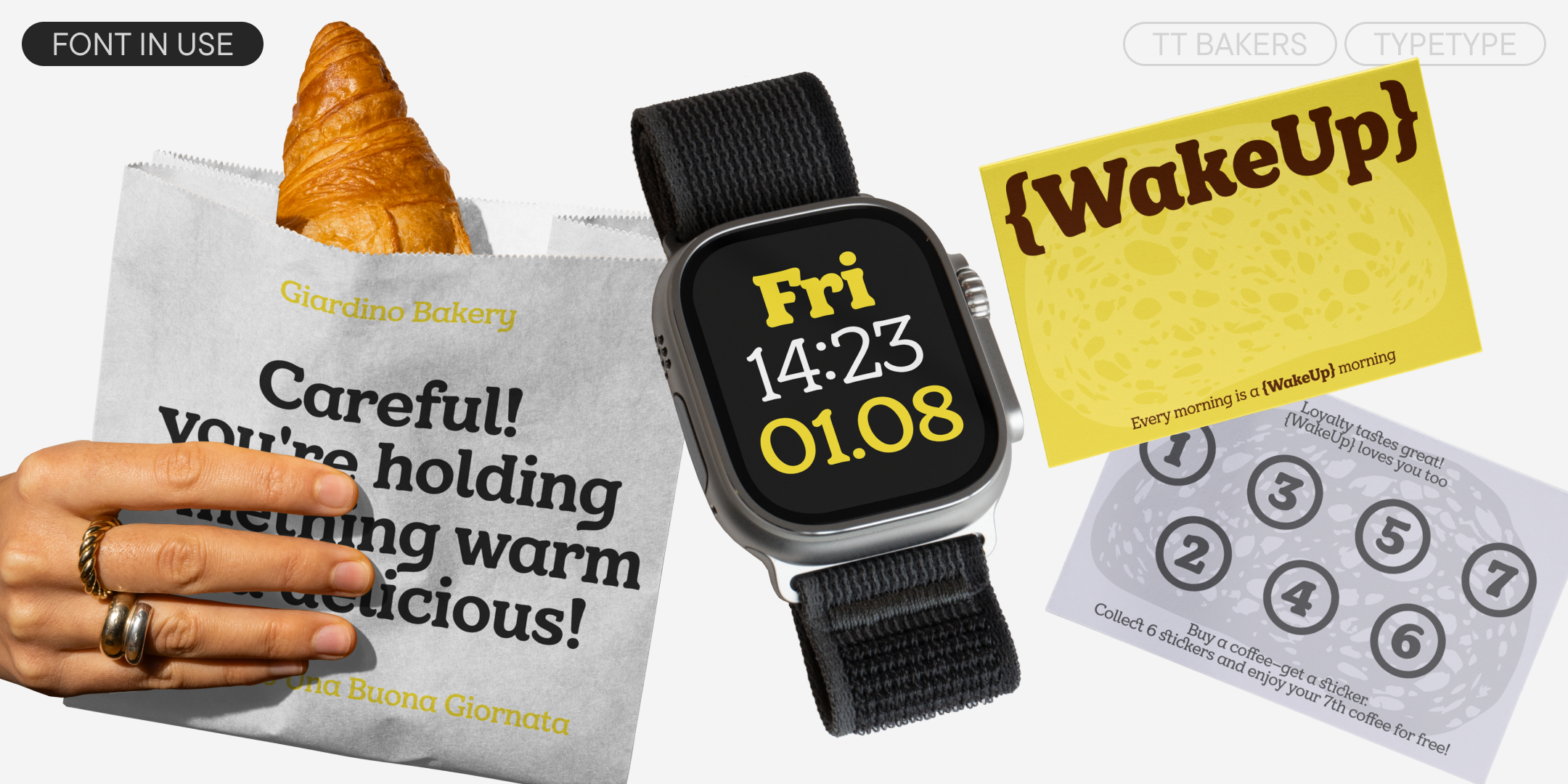
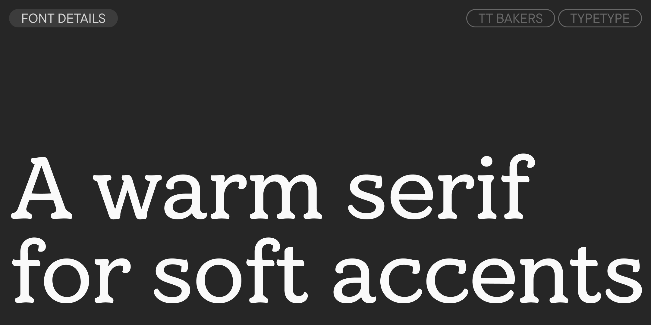
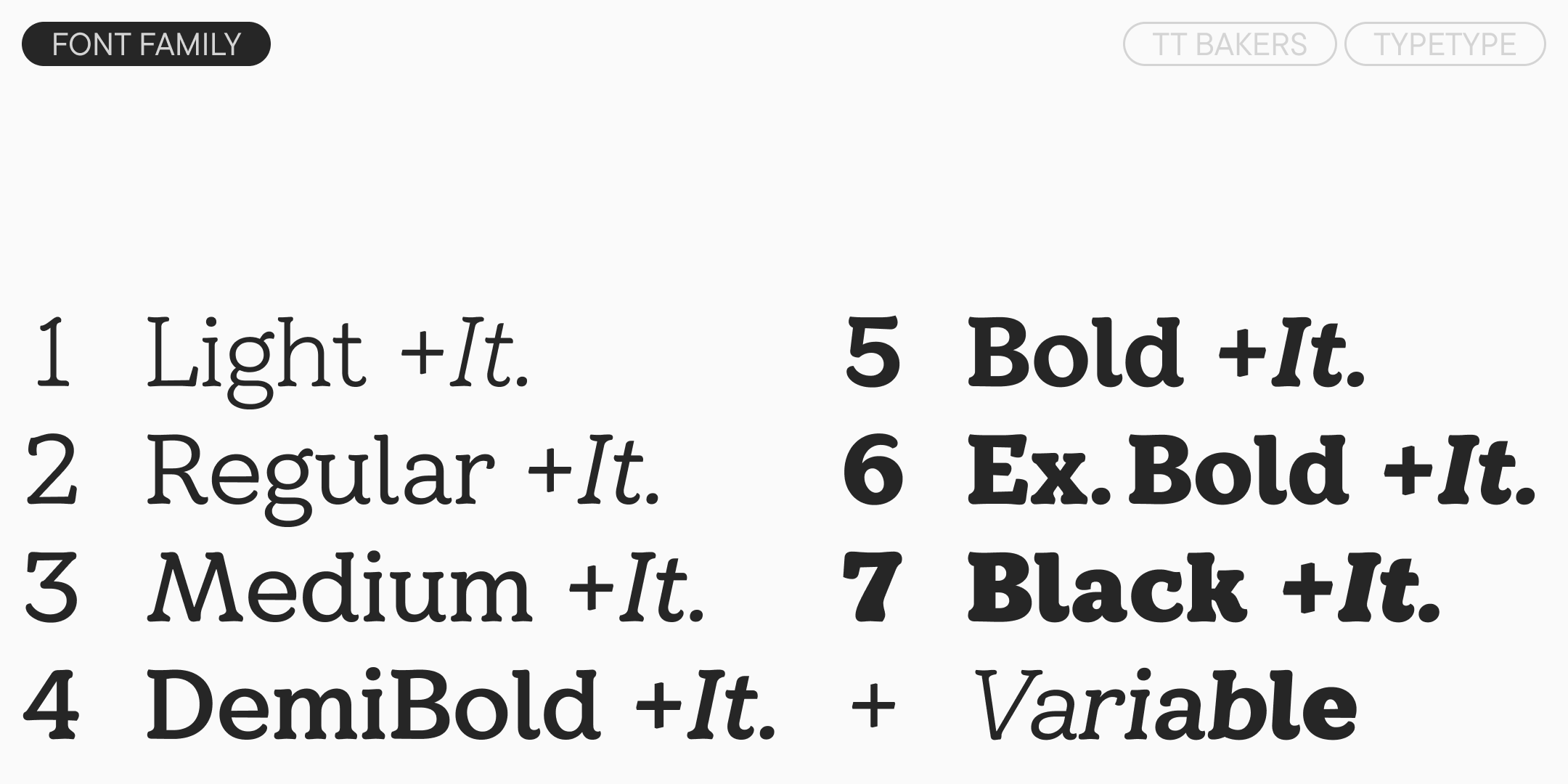
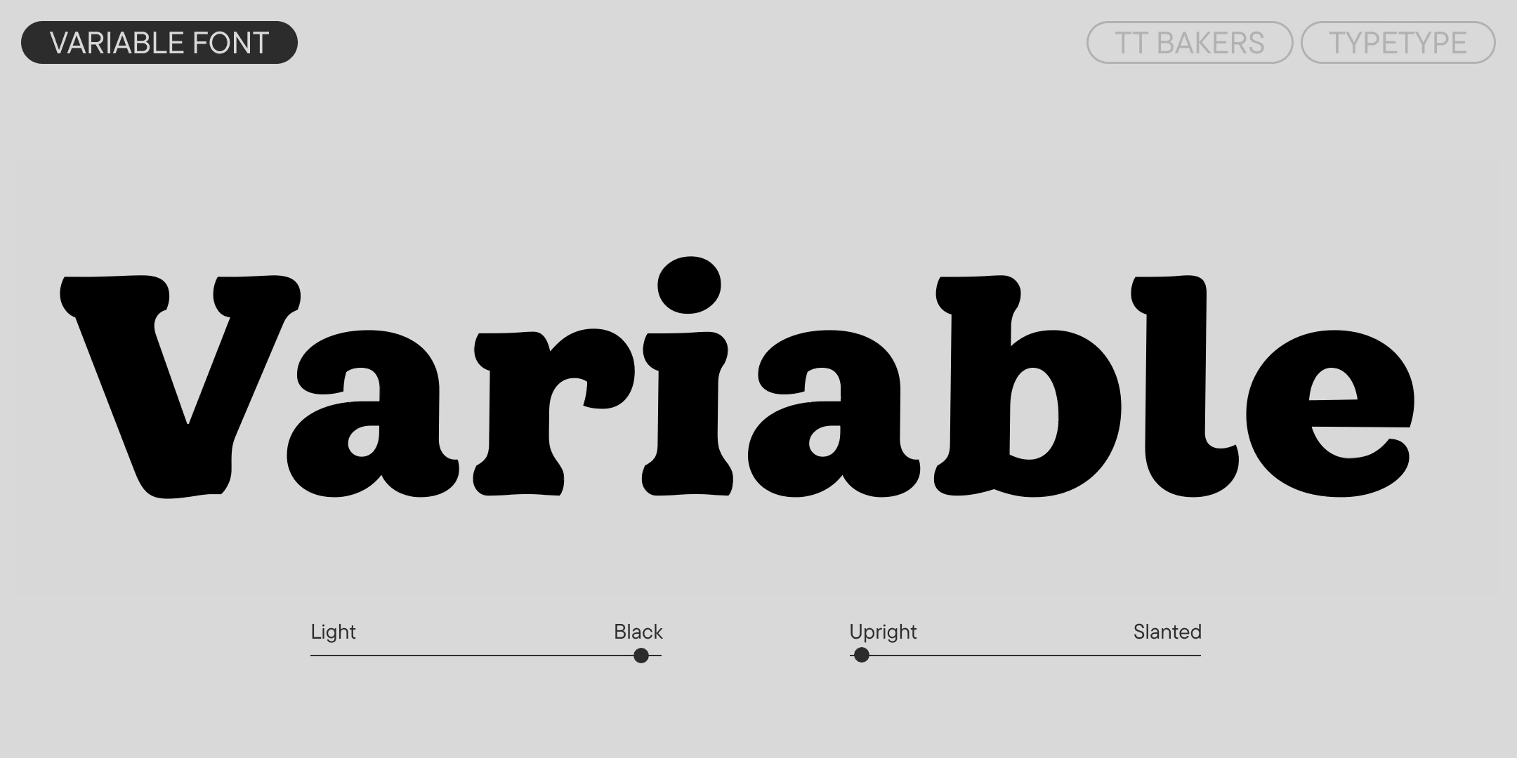
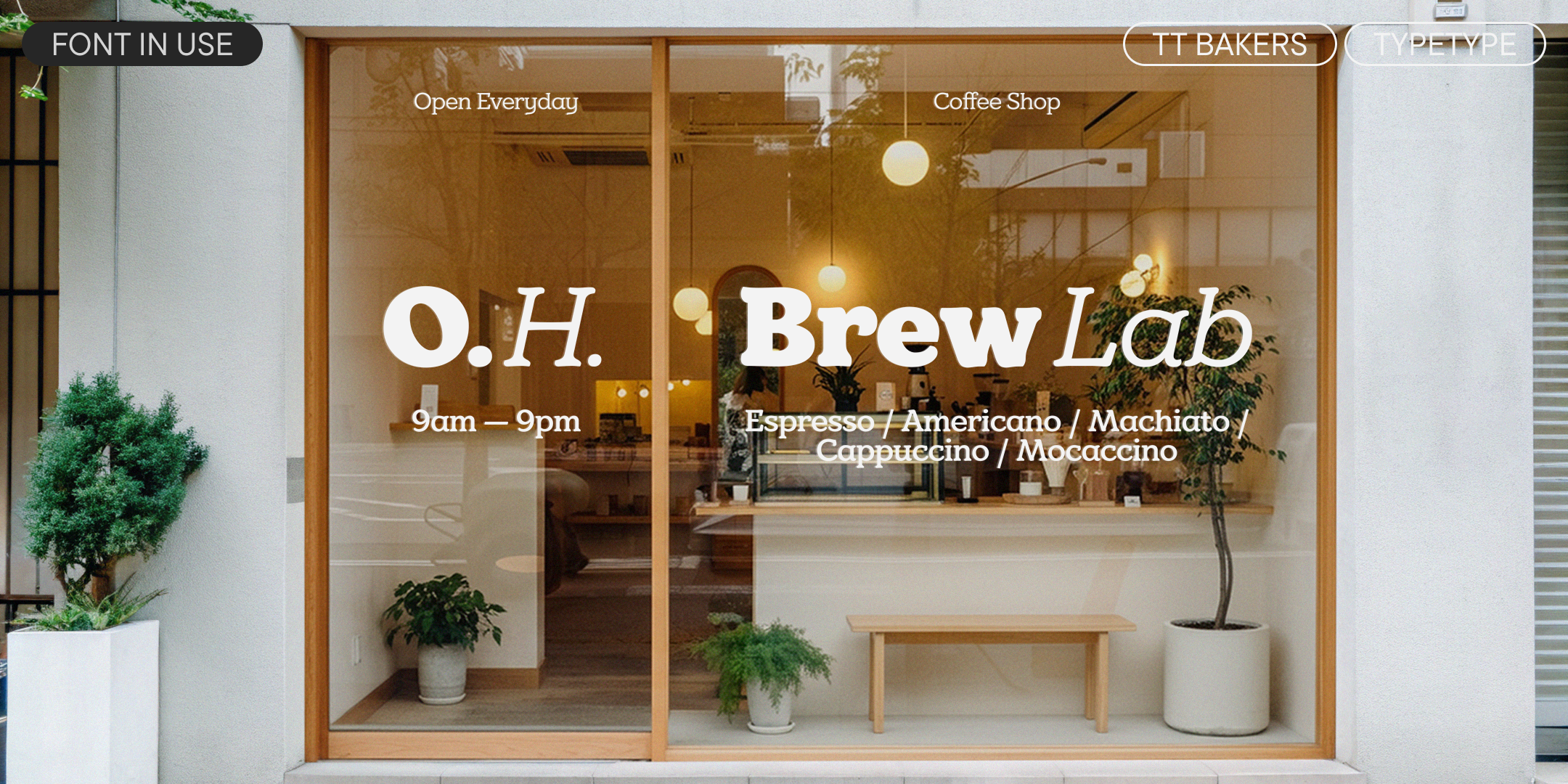
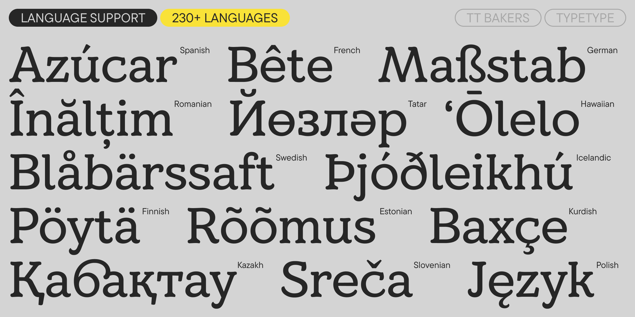
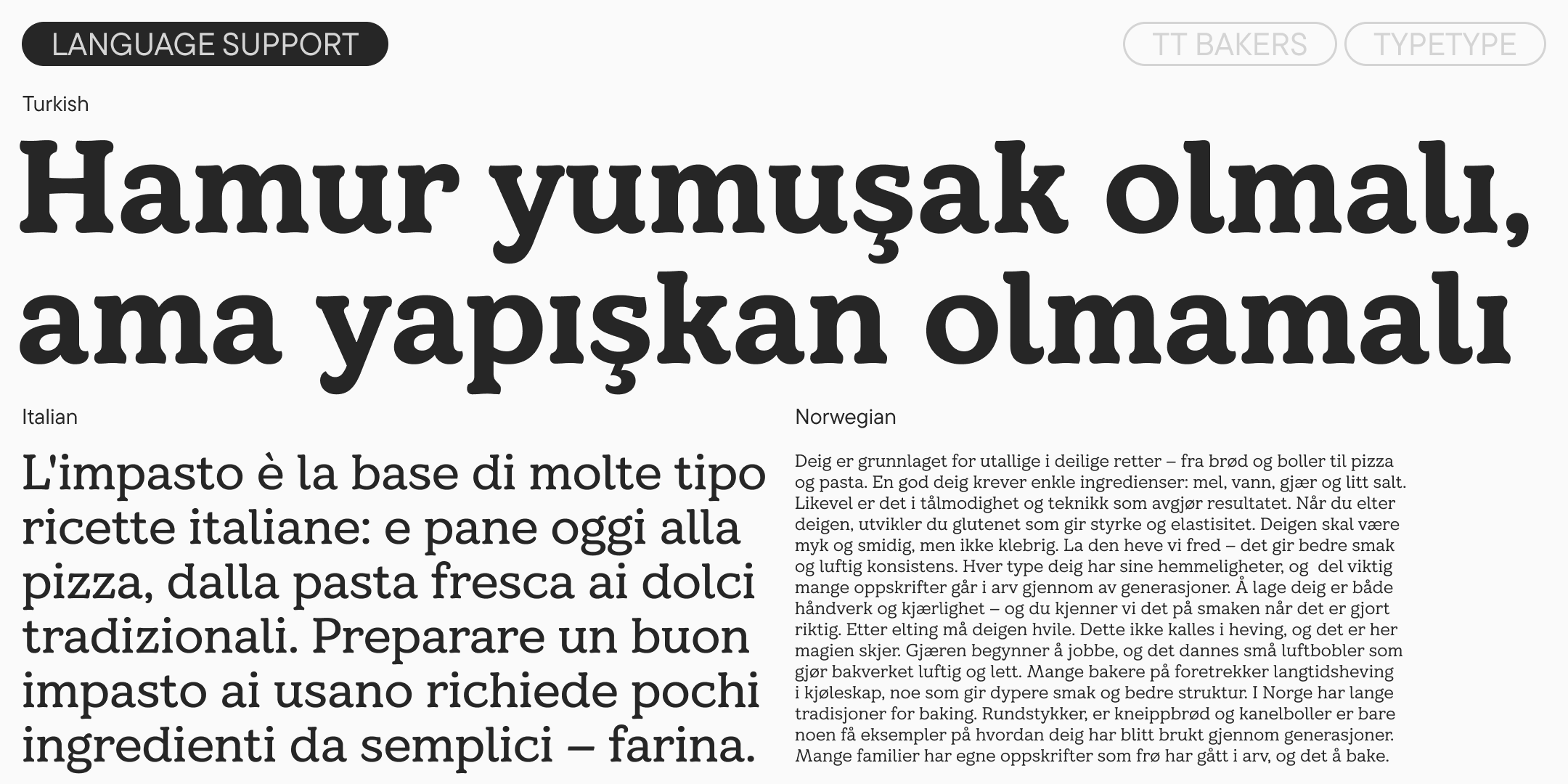
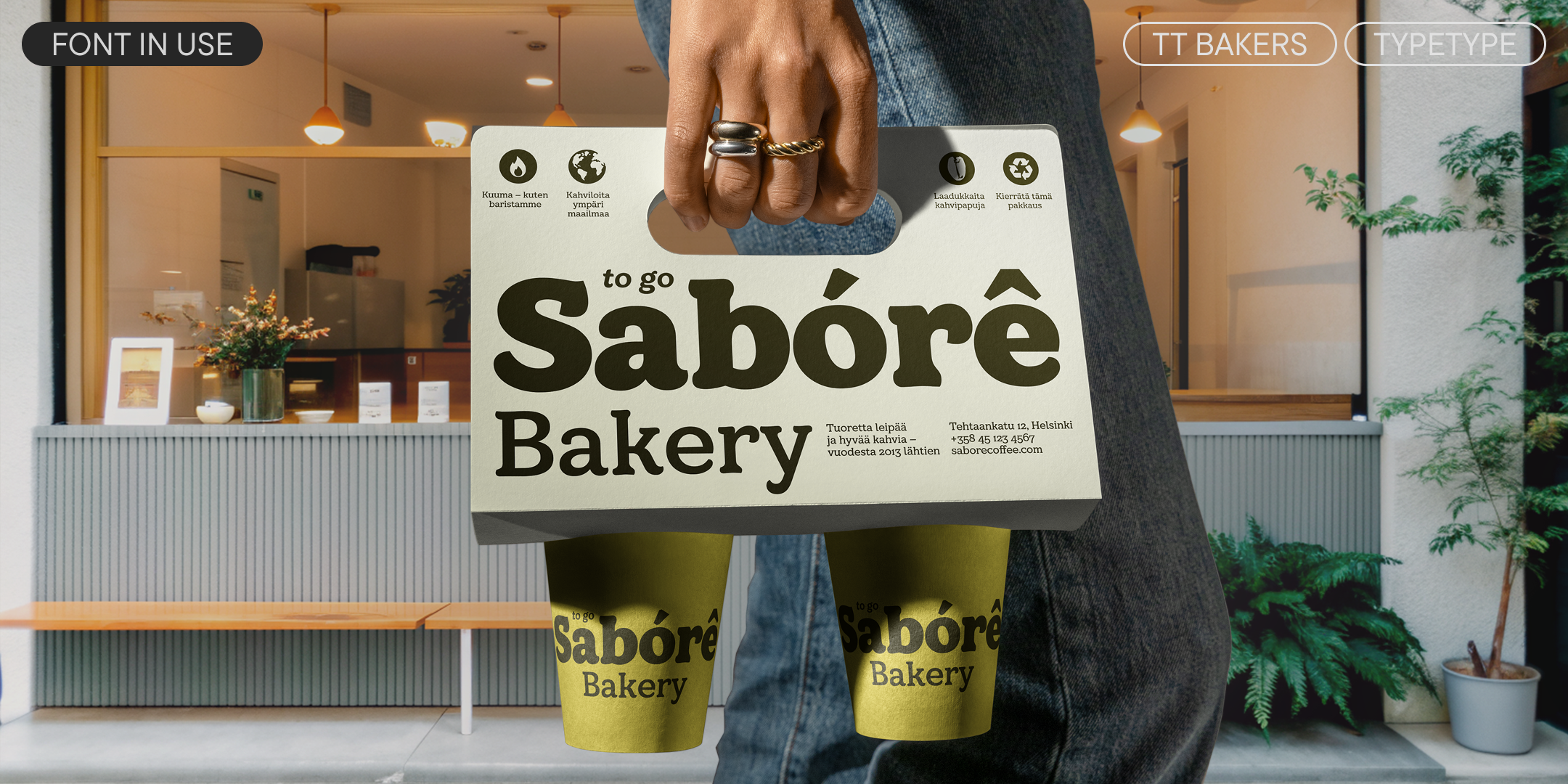
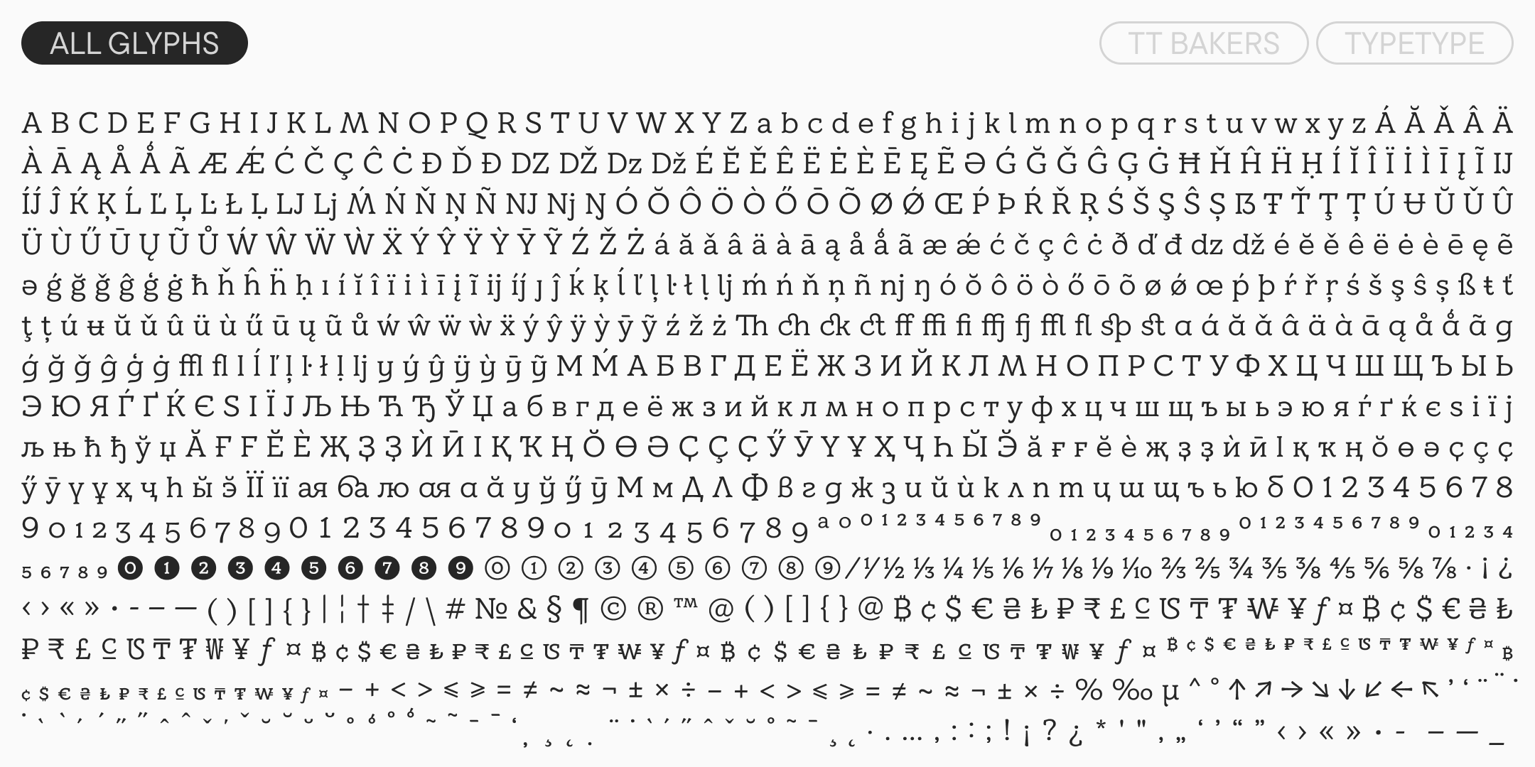
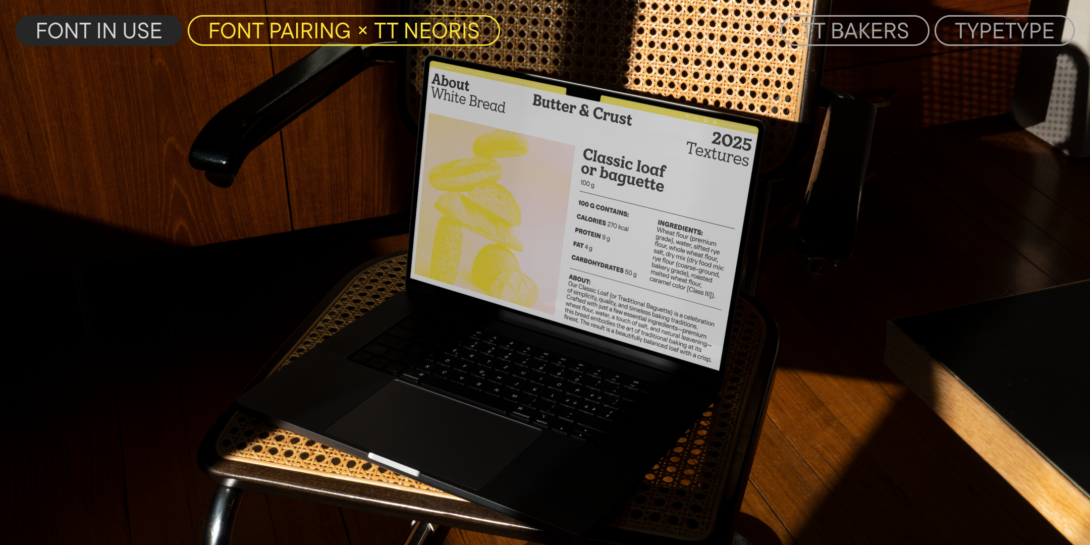
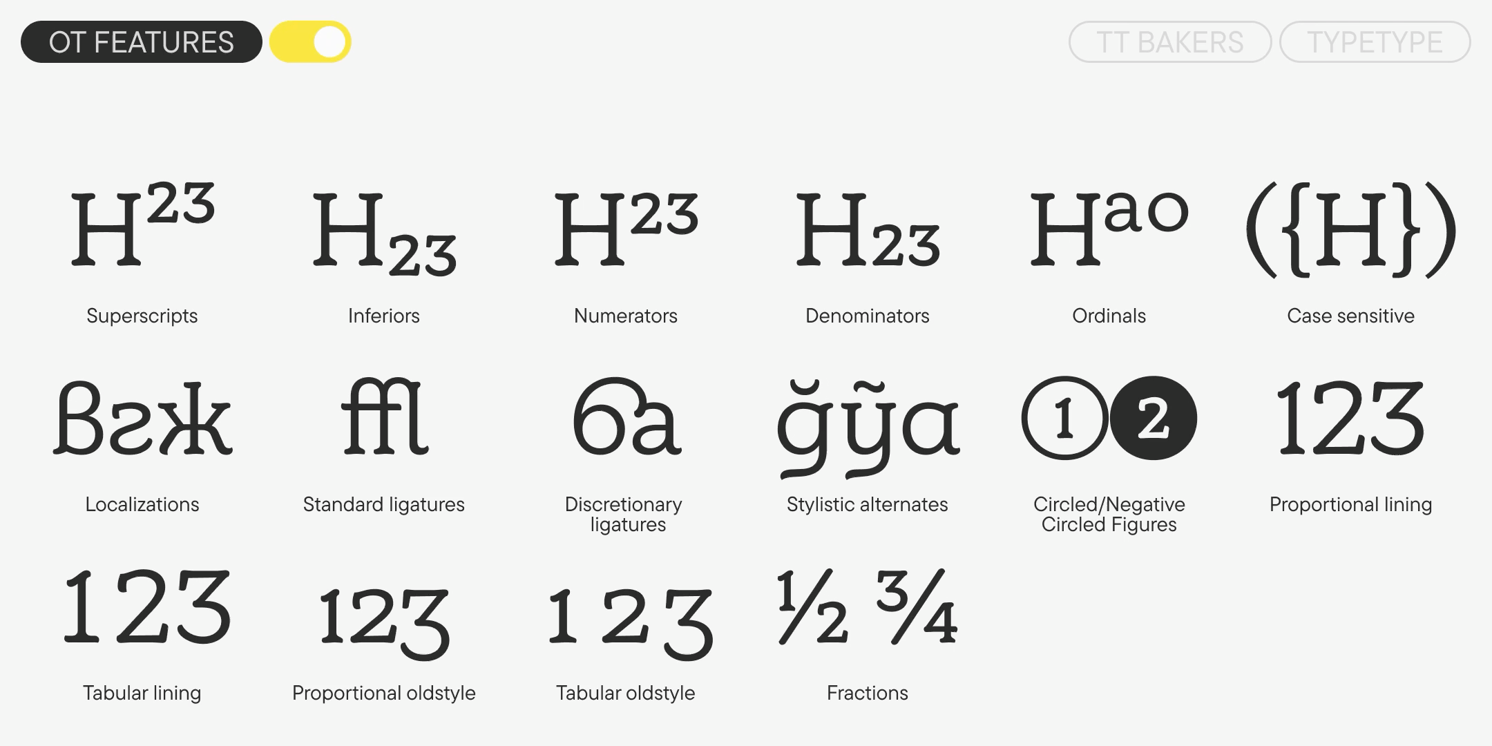
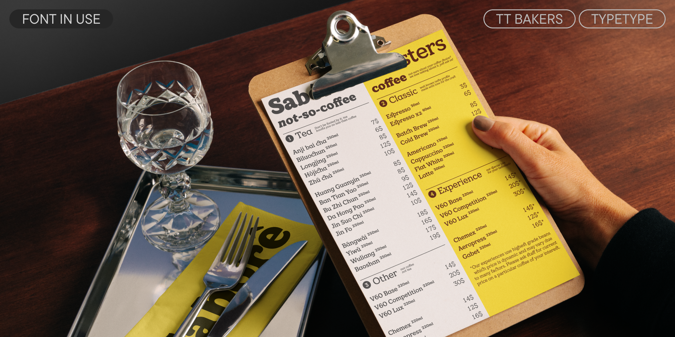
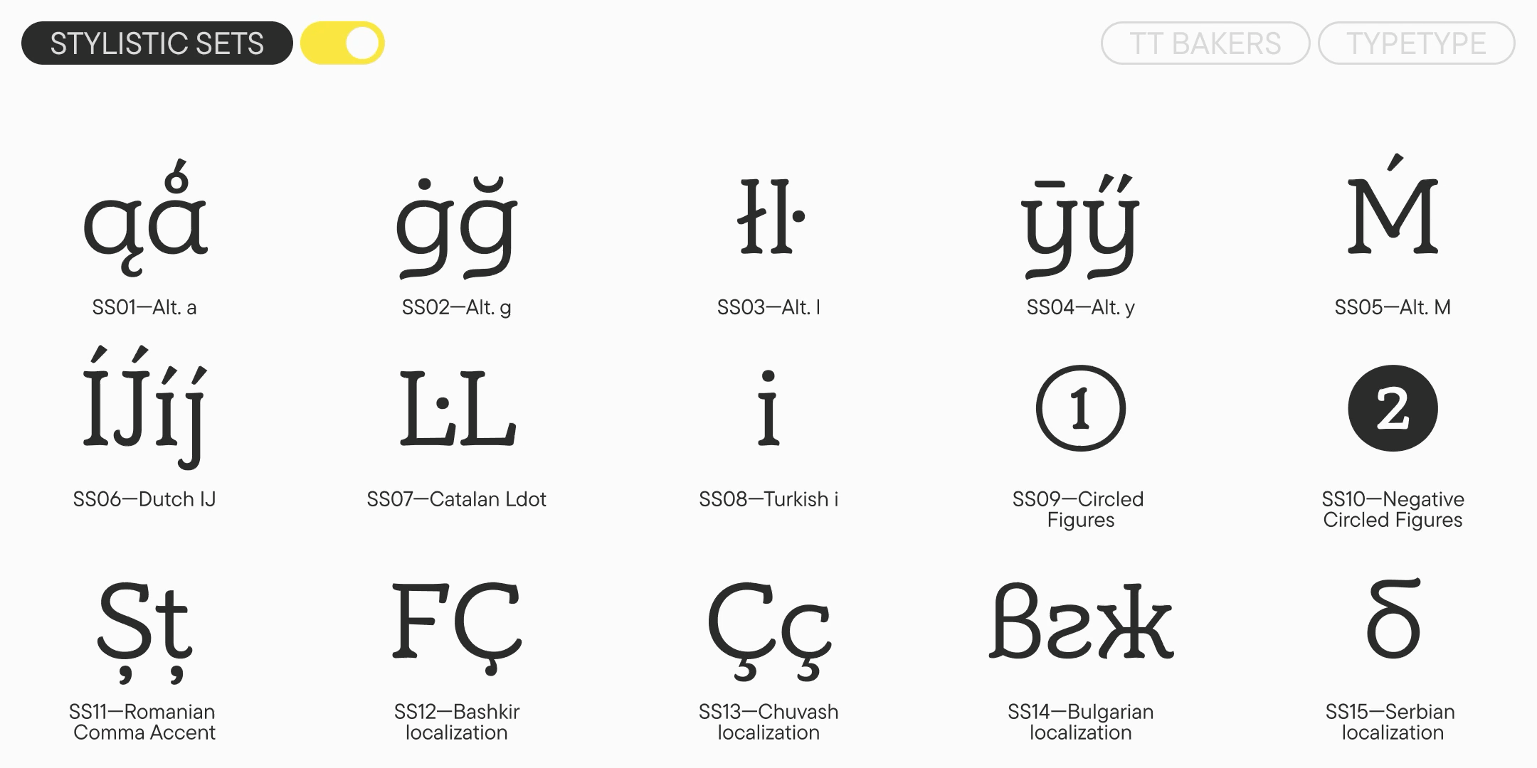
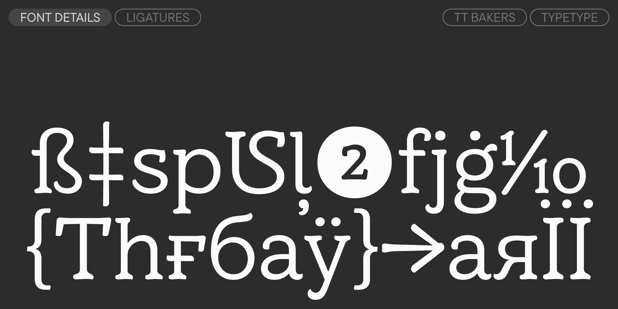
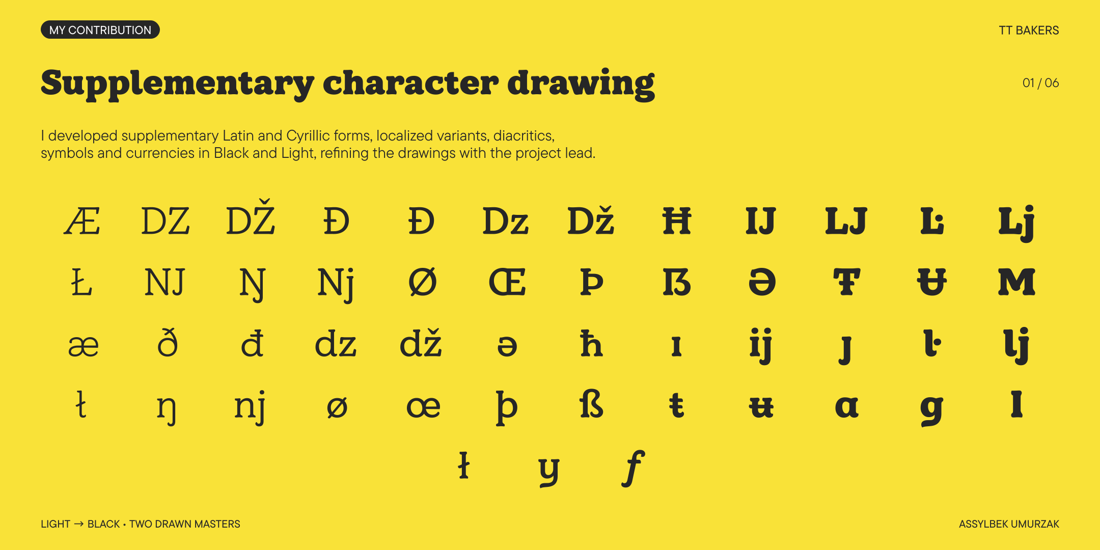
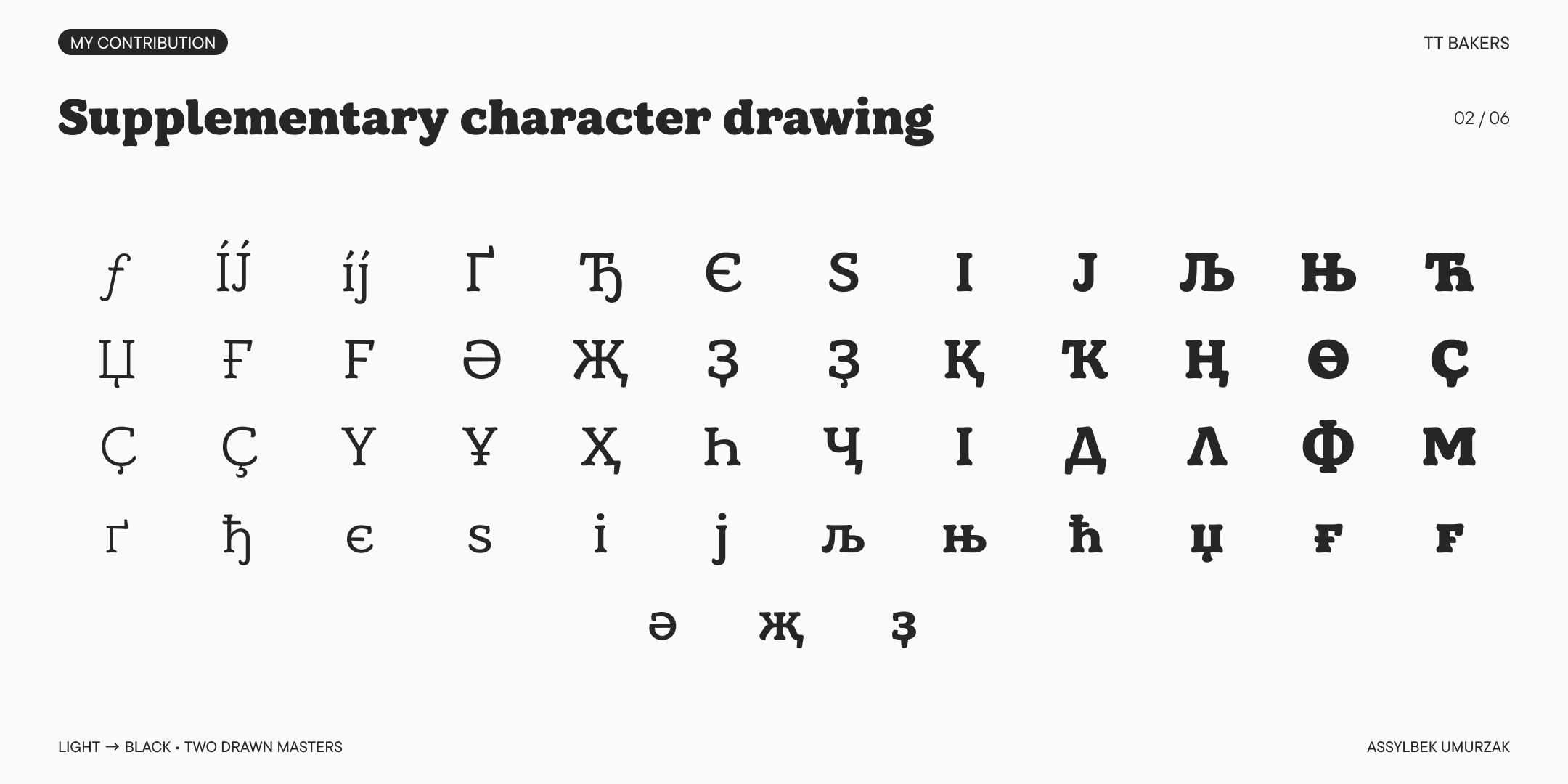
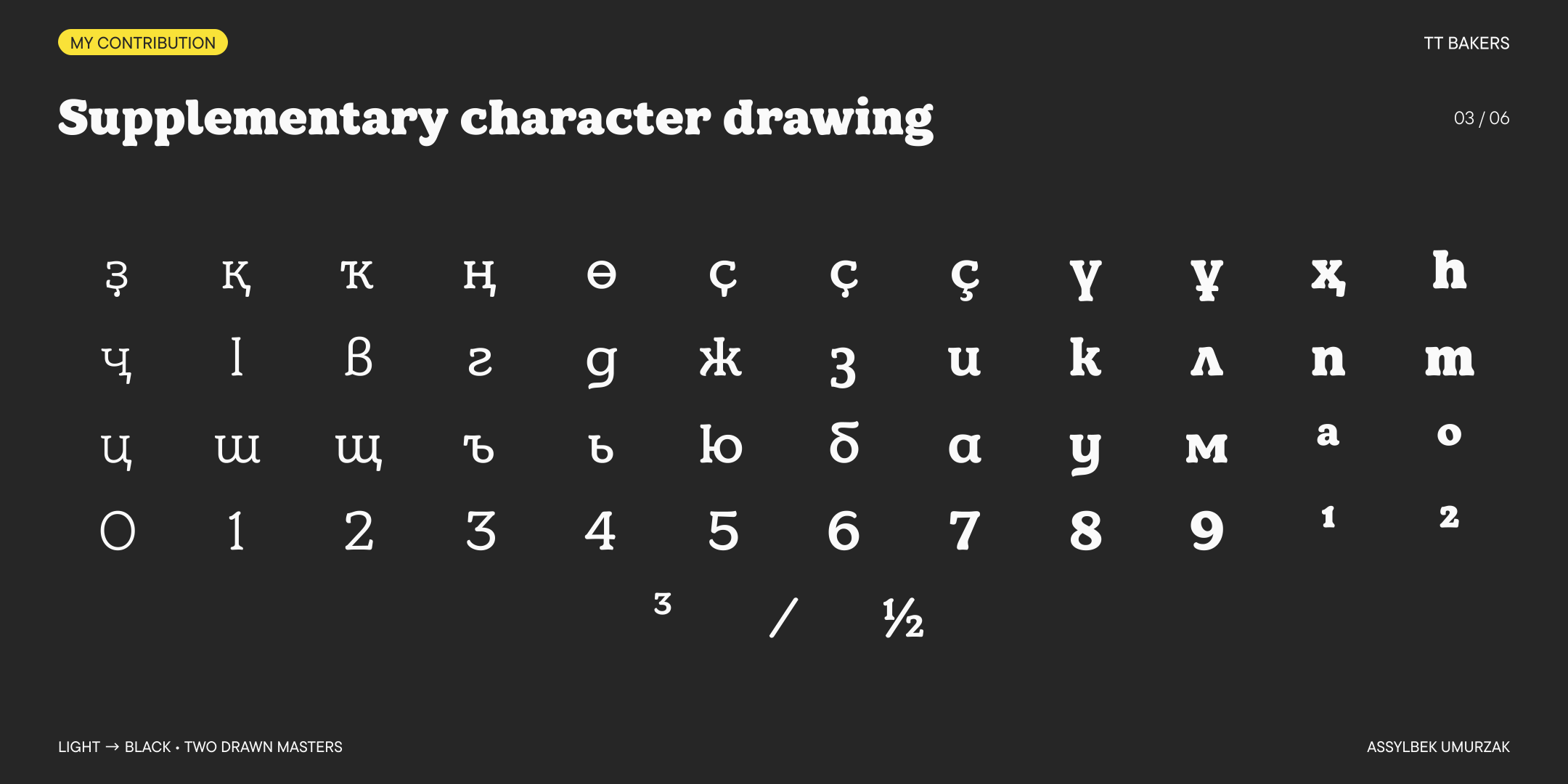
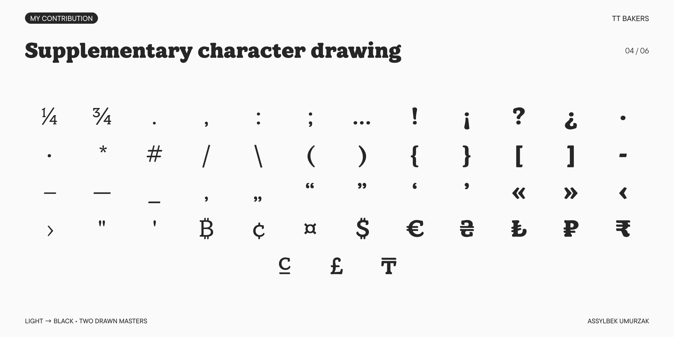
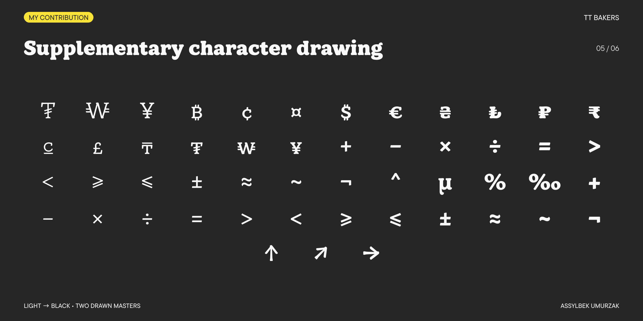
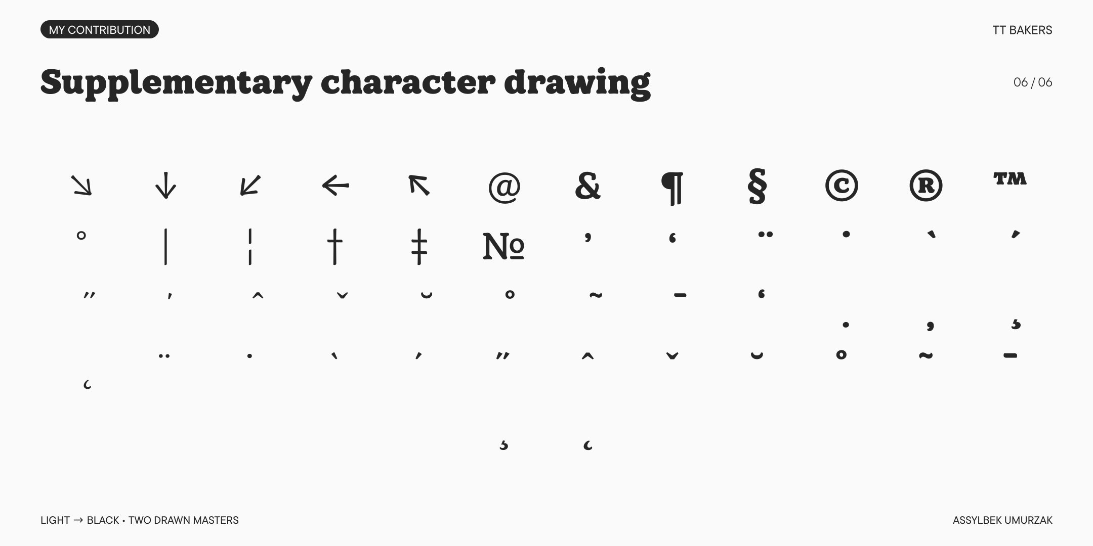
is a fluid serif by typetype, with a soft character and the movement of a brush.balanced contrast and generous spacing give its forms room to breathe, while asymmetricalserifs lead the eye along the line. its warmth comes forward in packaging and identity work,with a structure that also holds together in text. i joined the project to extend the team’sestablished design, developing supplementary latin and cyrillic coverage in light and black.the work included localized forms, diacritics, punctuation, mathematics, numeral systems,currencies and ligatures. in collaboration with the project lead, i refined the drawings,component construction and interpolation, carrying the family’s characteracross the additional forms and smaller detailsthat broaden its everyday use.
is a fluid serif by typetype, with a soft character andthe movement of a brush. balanced contrast and generousspacing give its forms room to breathe, while asymmetricalserifs lead the eye along the line. its warmth comes forwardin packaging and identity work, with a structure that alsoholds together in text. i joined the project to extendthe team’s established design, developing supplementarylatin and cyrillic coverage in light and black. the workincluded localized forms, diacritics, punctuation,mathematics, numeral systems, currencies and ligatures.in collaboration with the project lead, i refinedthe drawings, component construction and interpolation,carrying the family’s character across the additionalforms and smaller detailsthat broaden its everyday use.