oro
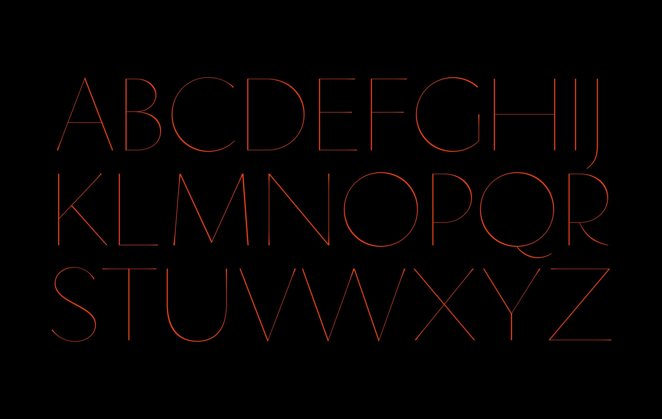
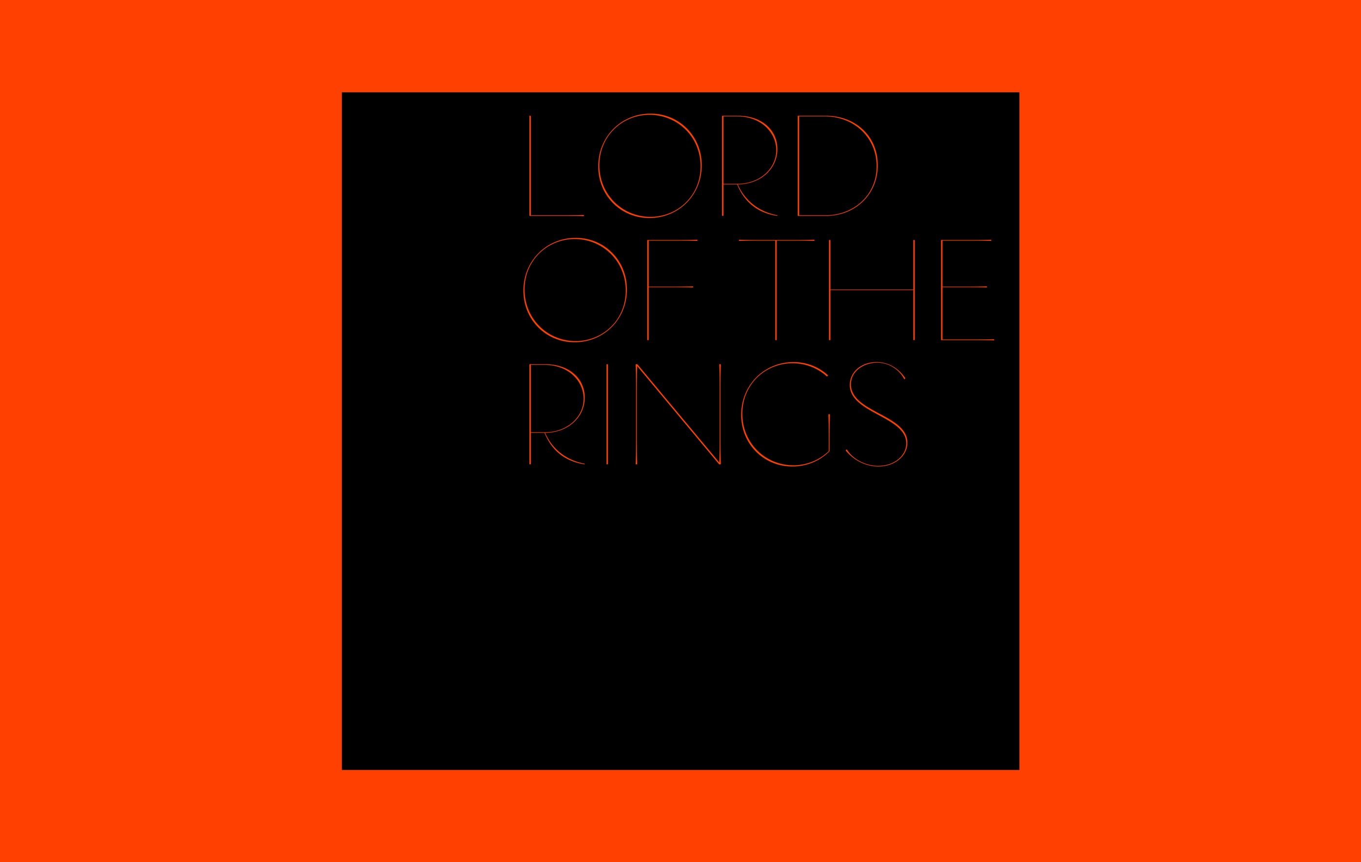
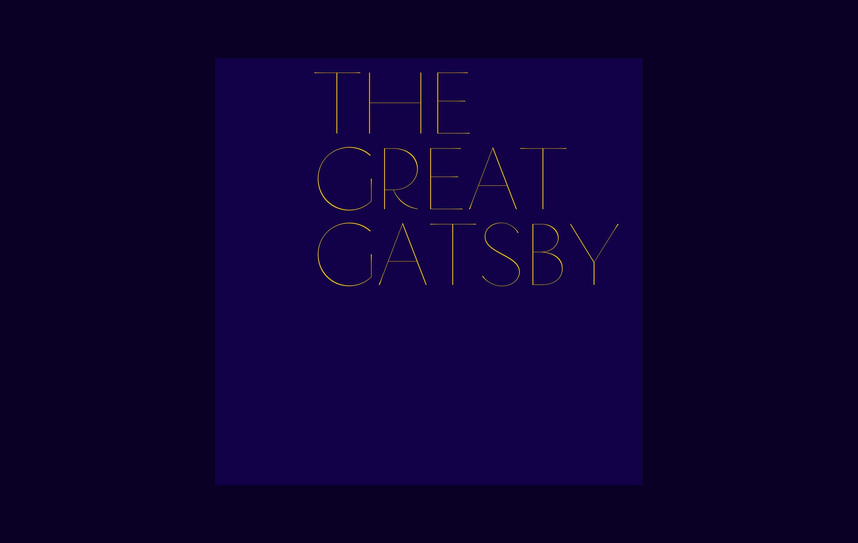
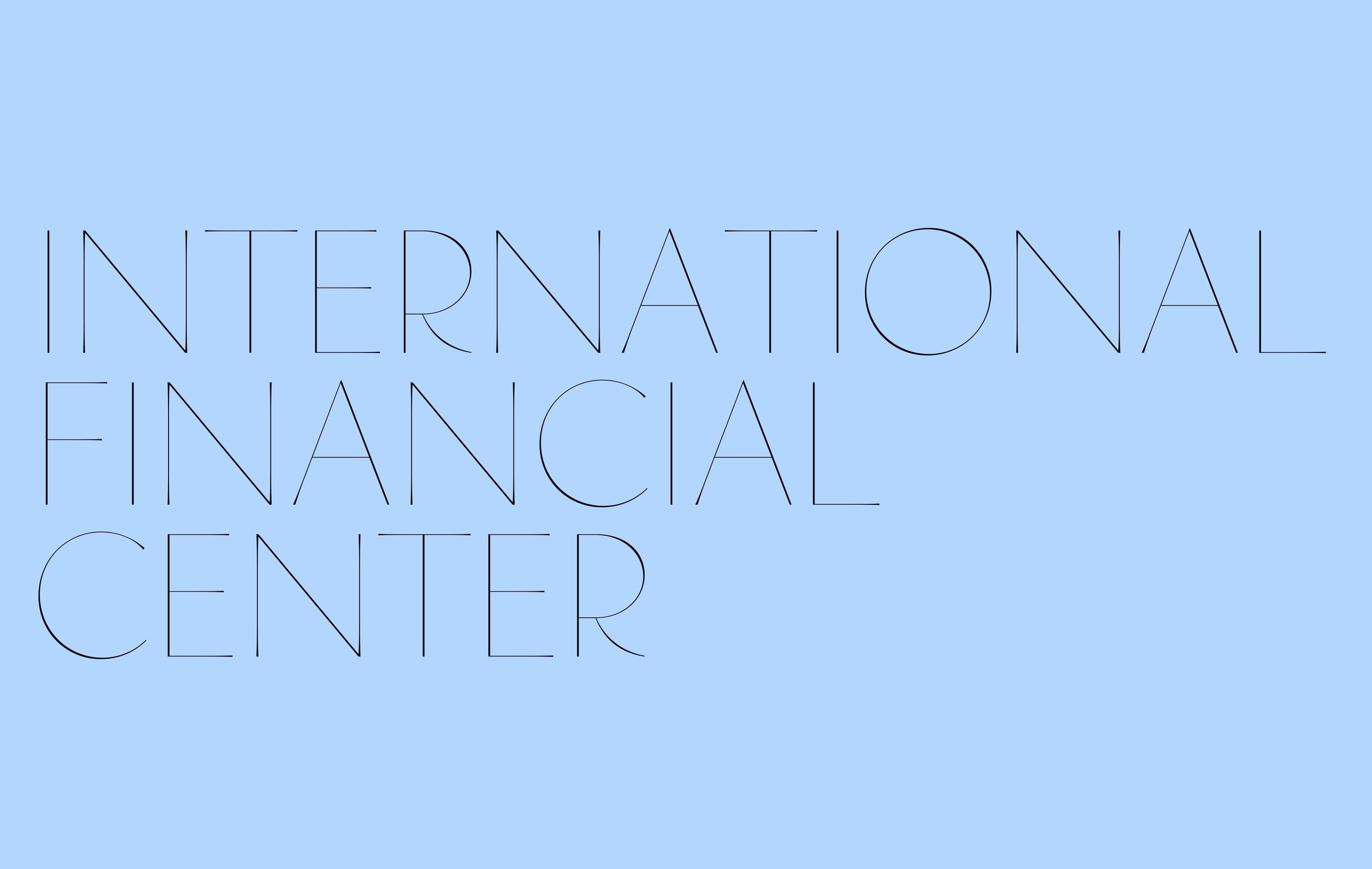
explores an extremely light weight,where the letters become so thin they almost disappear from the page.it is precisely this near absence that gives the typefaceits delicate and luminous quality.although every letter is filledwith solid colour,the forms seemto shine.
credits
- type design
- Assylbek Umurzak