invictus

is one of the largest chains of fitness centers in central asia,operating more than forty clubs across kazakhstan, azerbaijan and kyrgyzstan.they approached me to design a typeface for their rebranding.the task was to create a voice for the brand that would communicate boththeir tech-oriented approach to fitness,as well as the passion and the spirit of sport they bringto every location.
nvcts wordmark in white on black
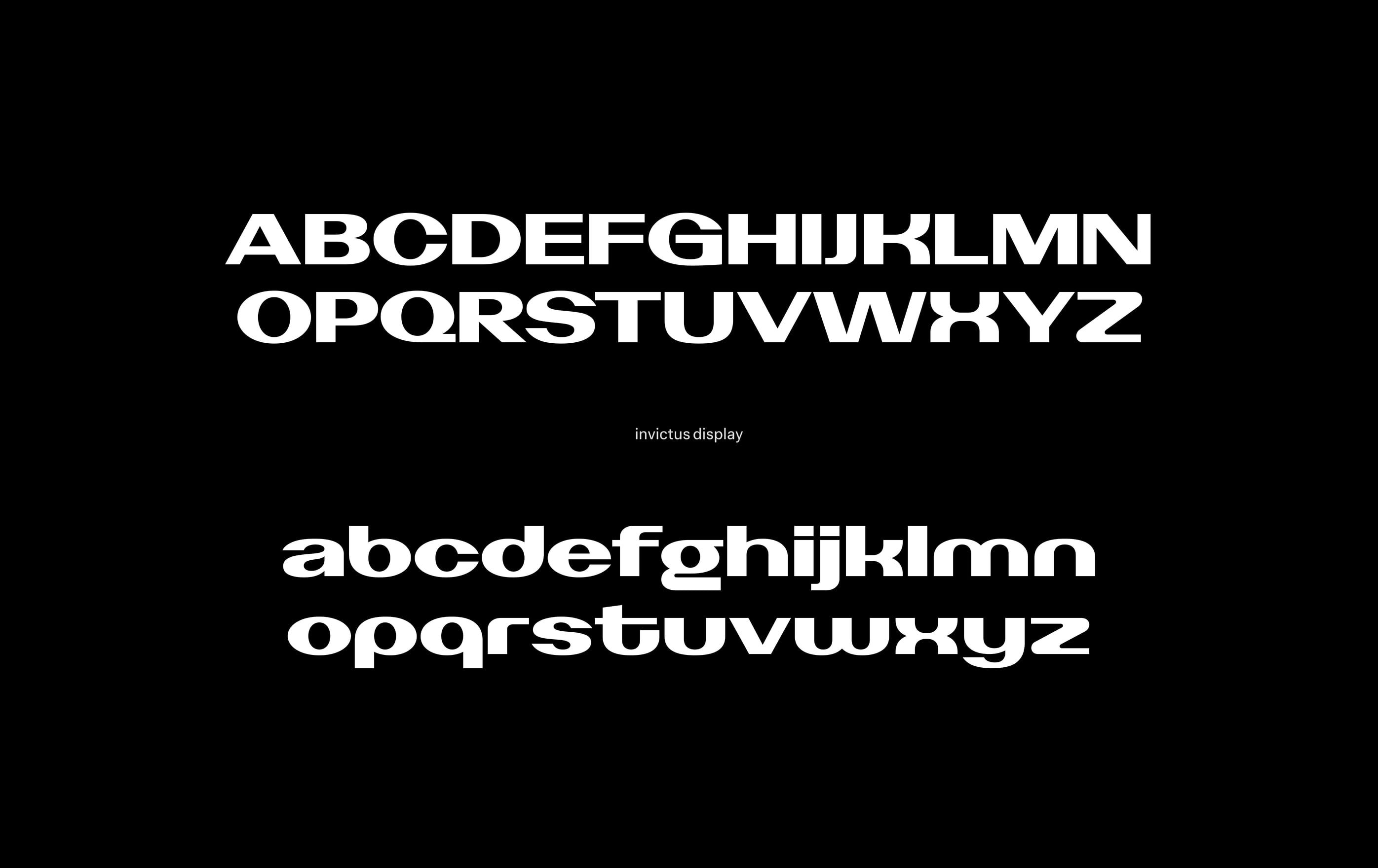
the nvcts typeface, upper- and lowercase alphabet in white on black
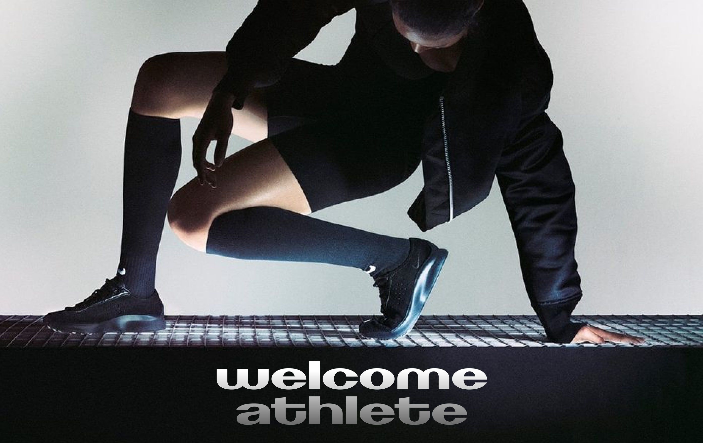
athlete crouching at a starting line above the words "welcome athlete"
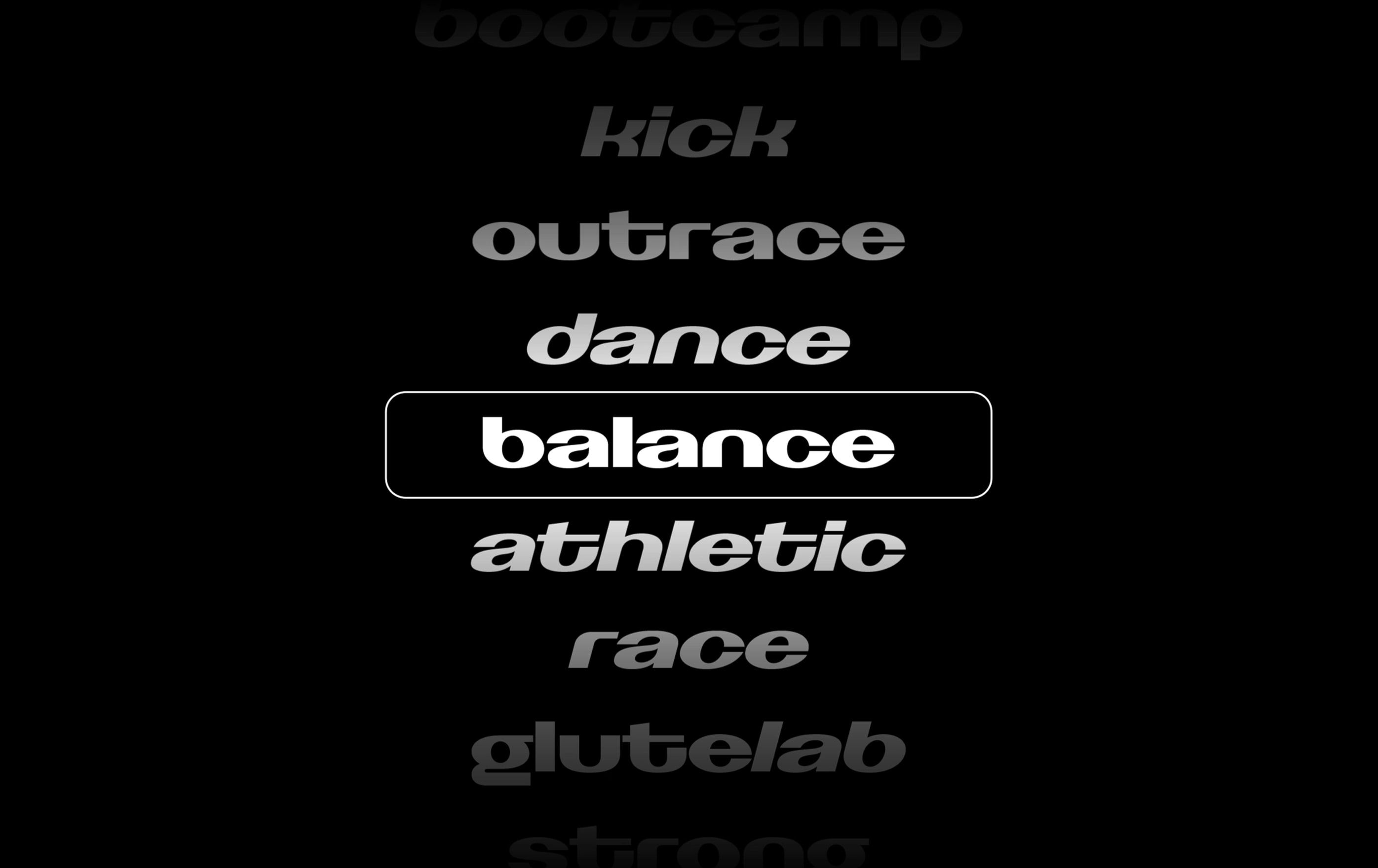
list of class names set in nvcts, with "balance" outlined
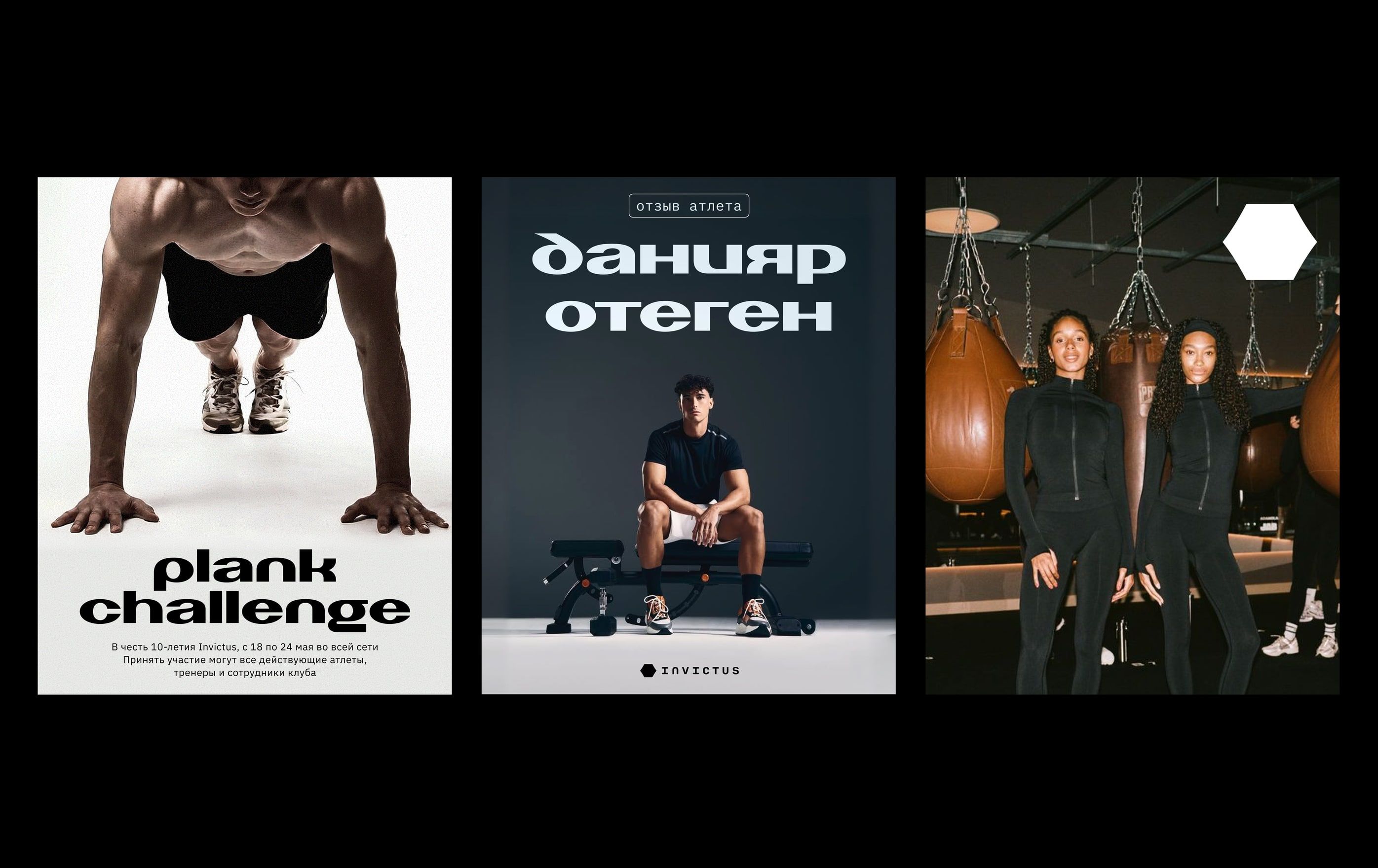
three posters: "plank challenge", a coach announcement in cyrillic and a group portrait
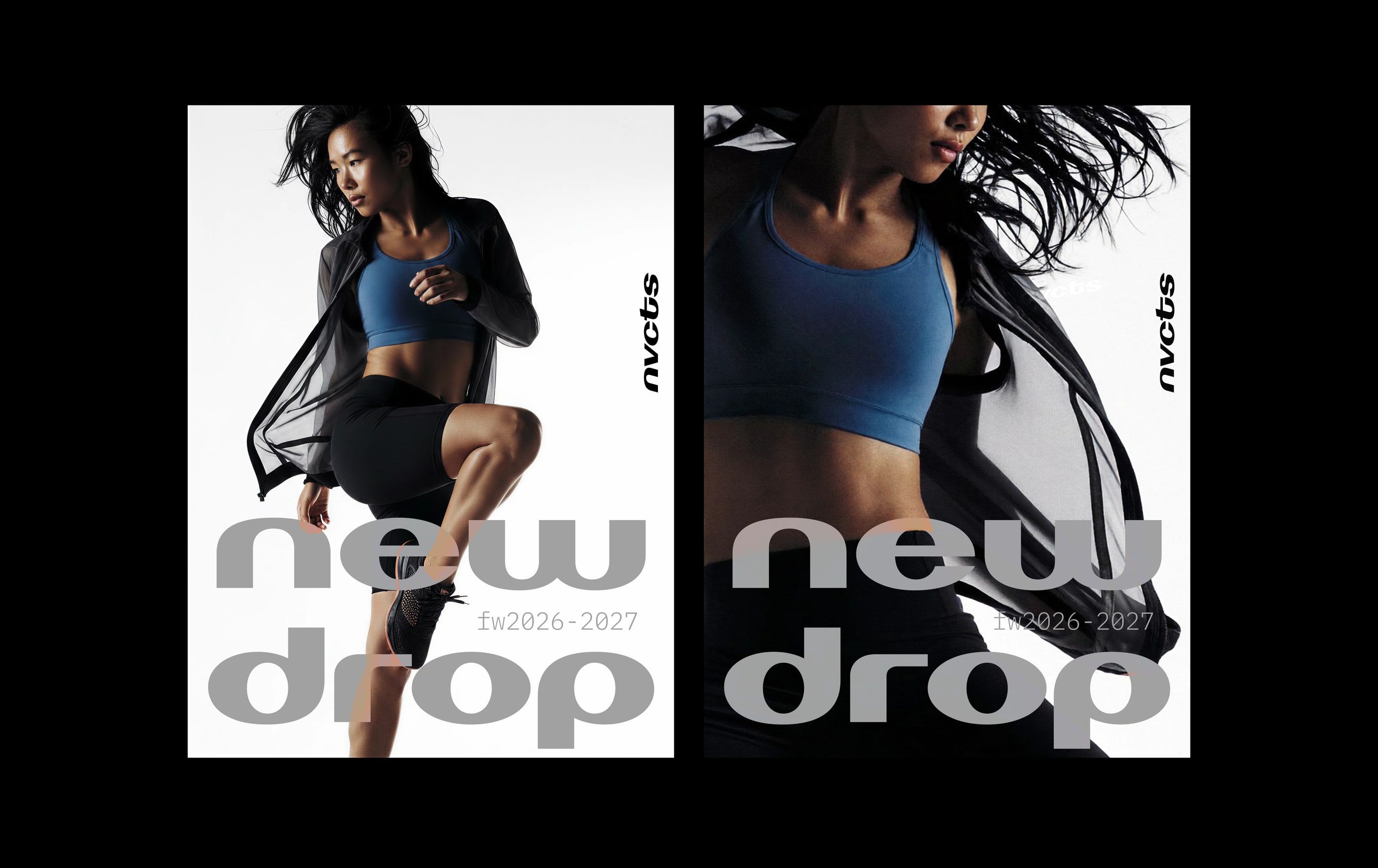
two "new drop" posters with an athlete in sportswear
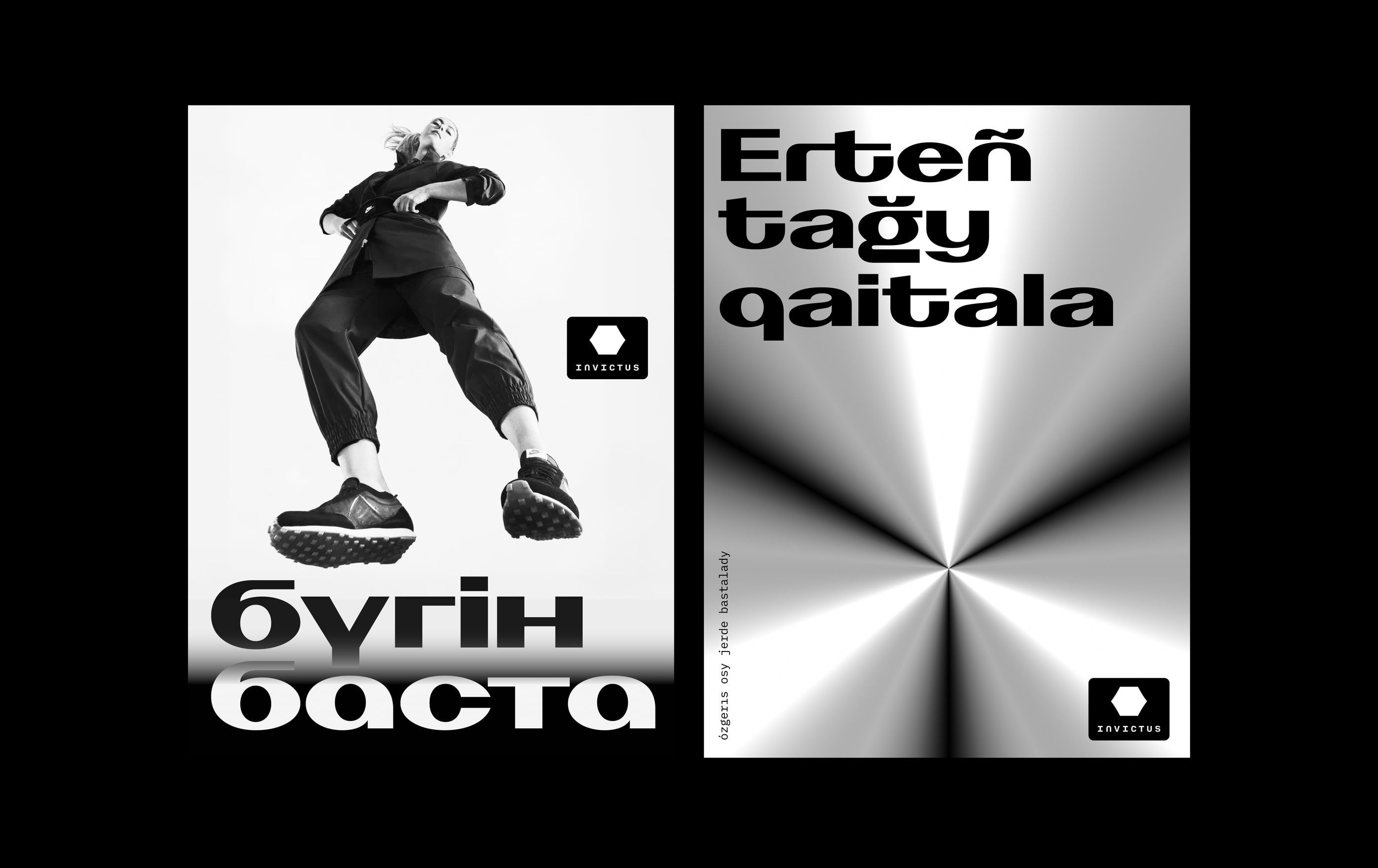
two kazakh posters, "бүгін баста" with a jumping figure and "erteñ tağy qaitala"
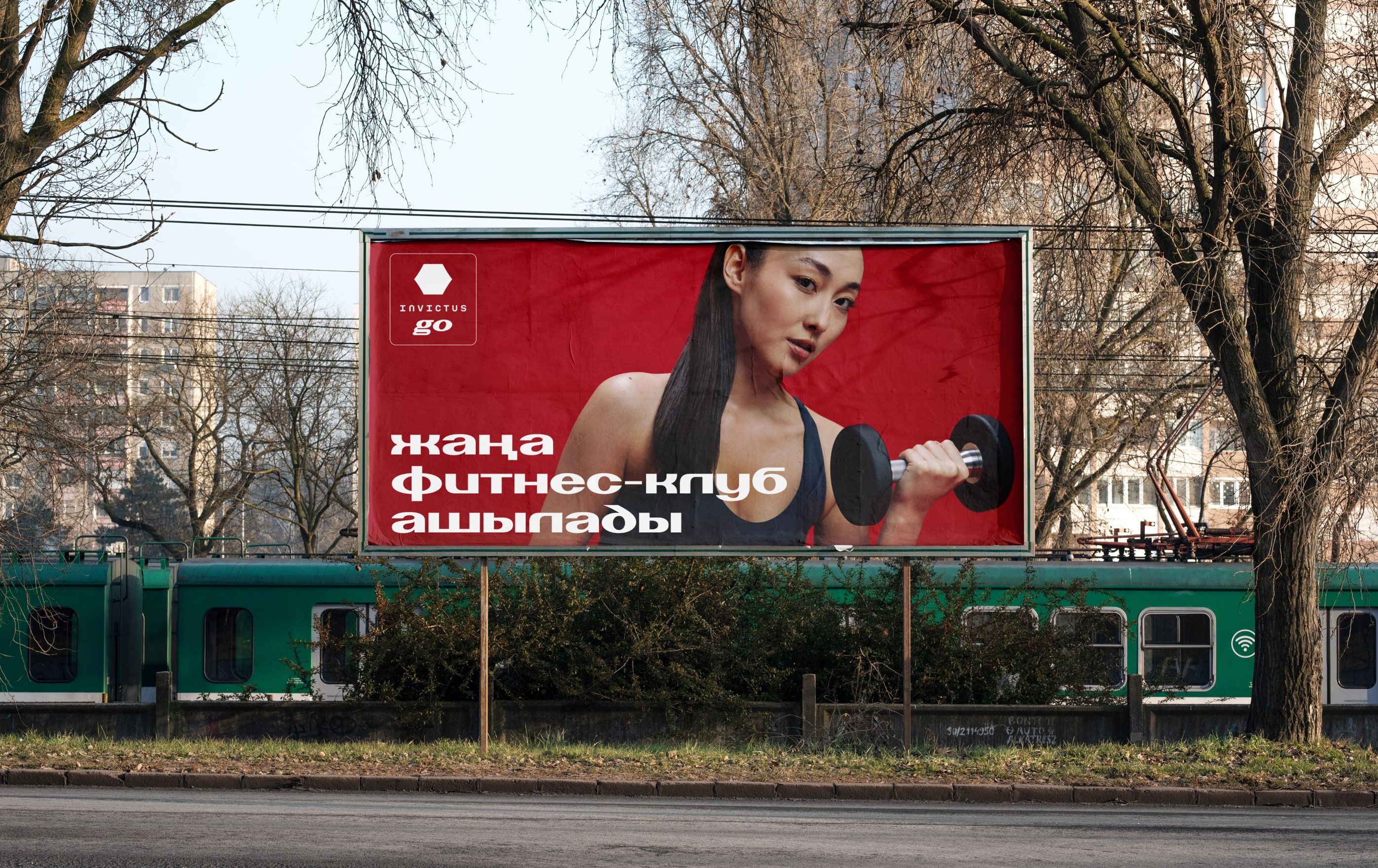
red nvcts billboard above a city railway
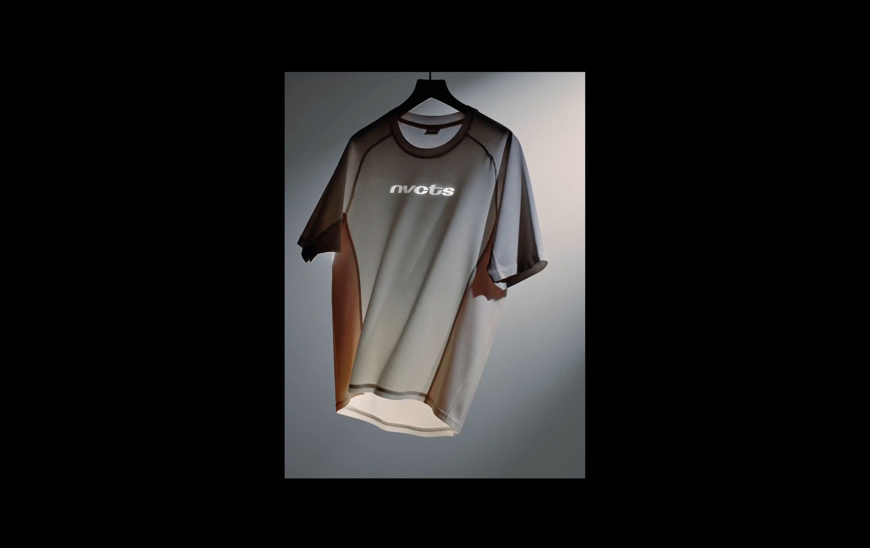
grey training t-shirt printed with the nvcts wordmark
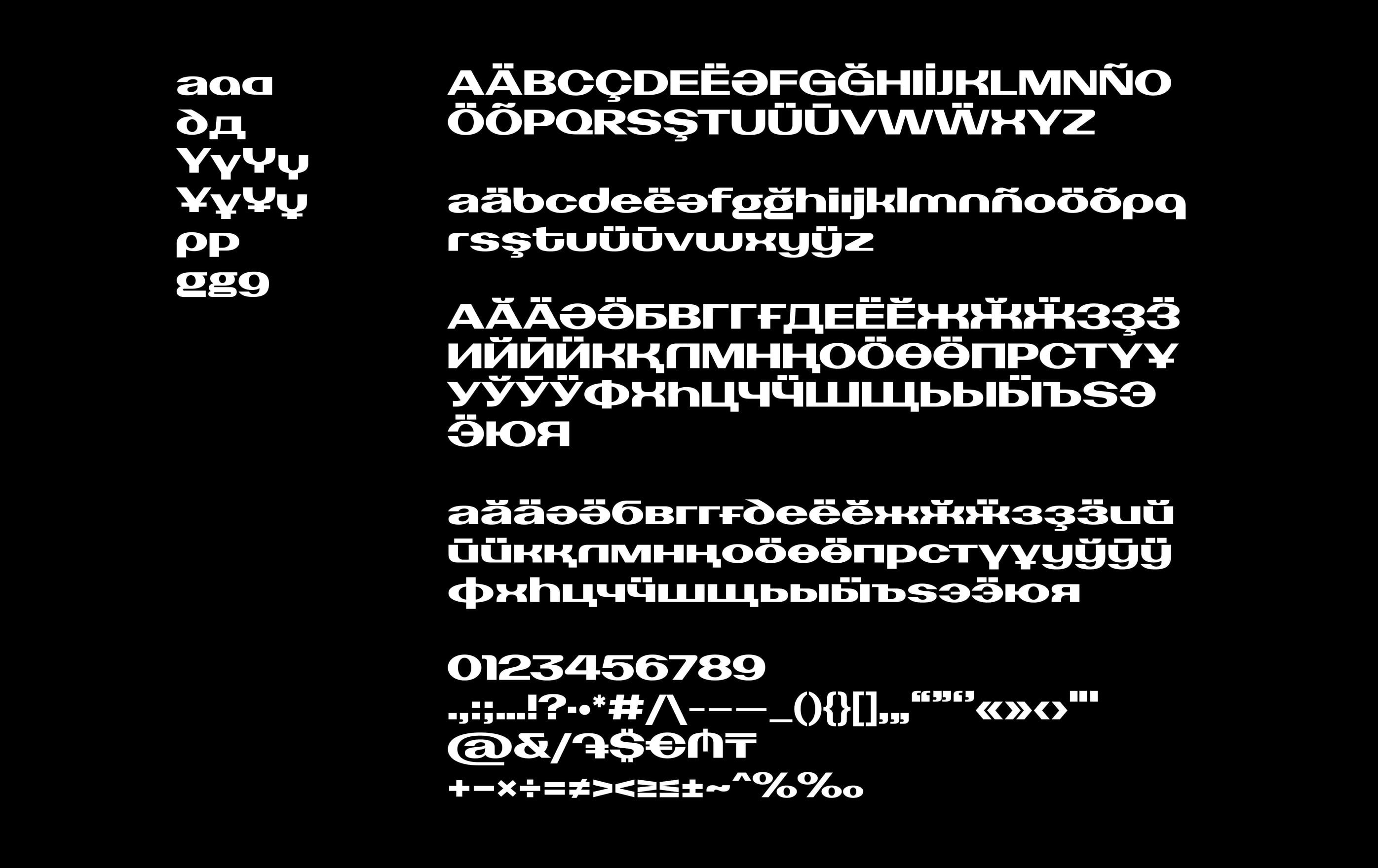
the full nvcts character set, latin and cyrillic

credits

type design
Assylbek Umurzak
creative direction
Dina Issaeva
graphic design
Anna Esedullaeva