h2h grotesque
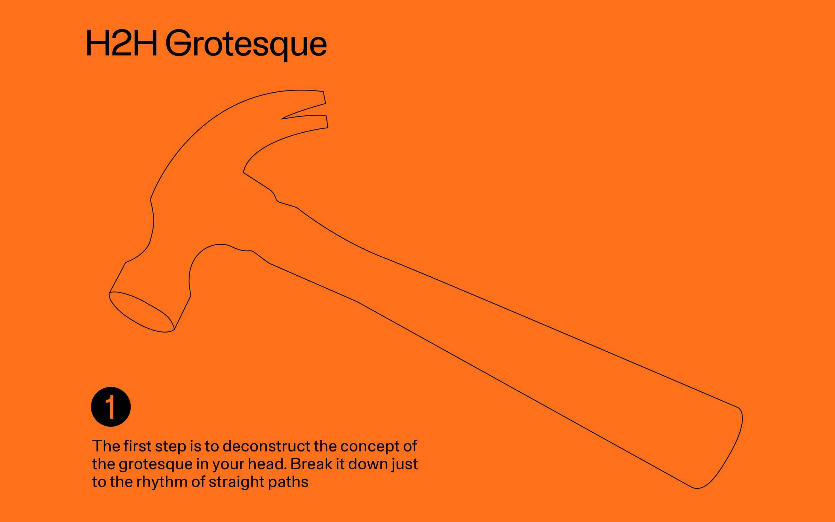
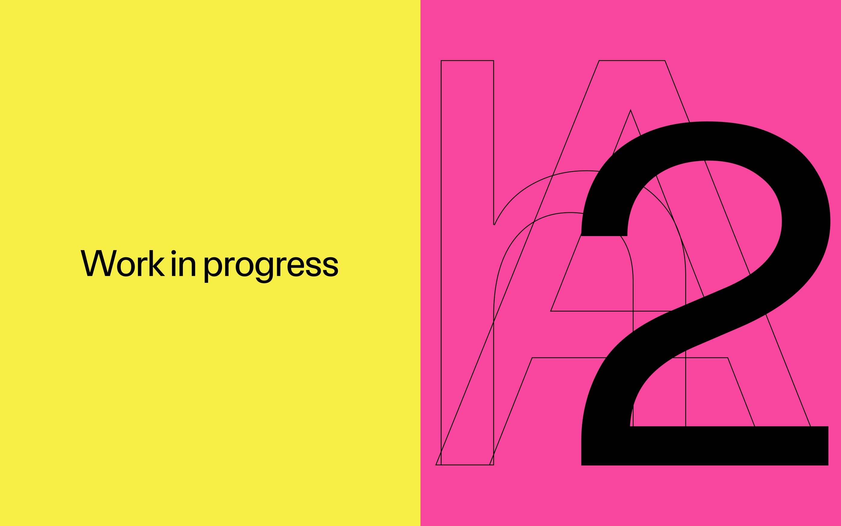
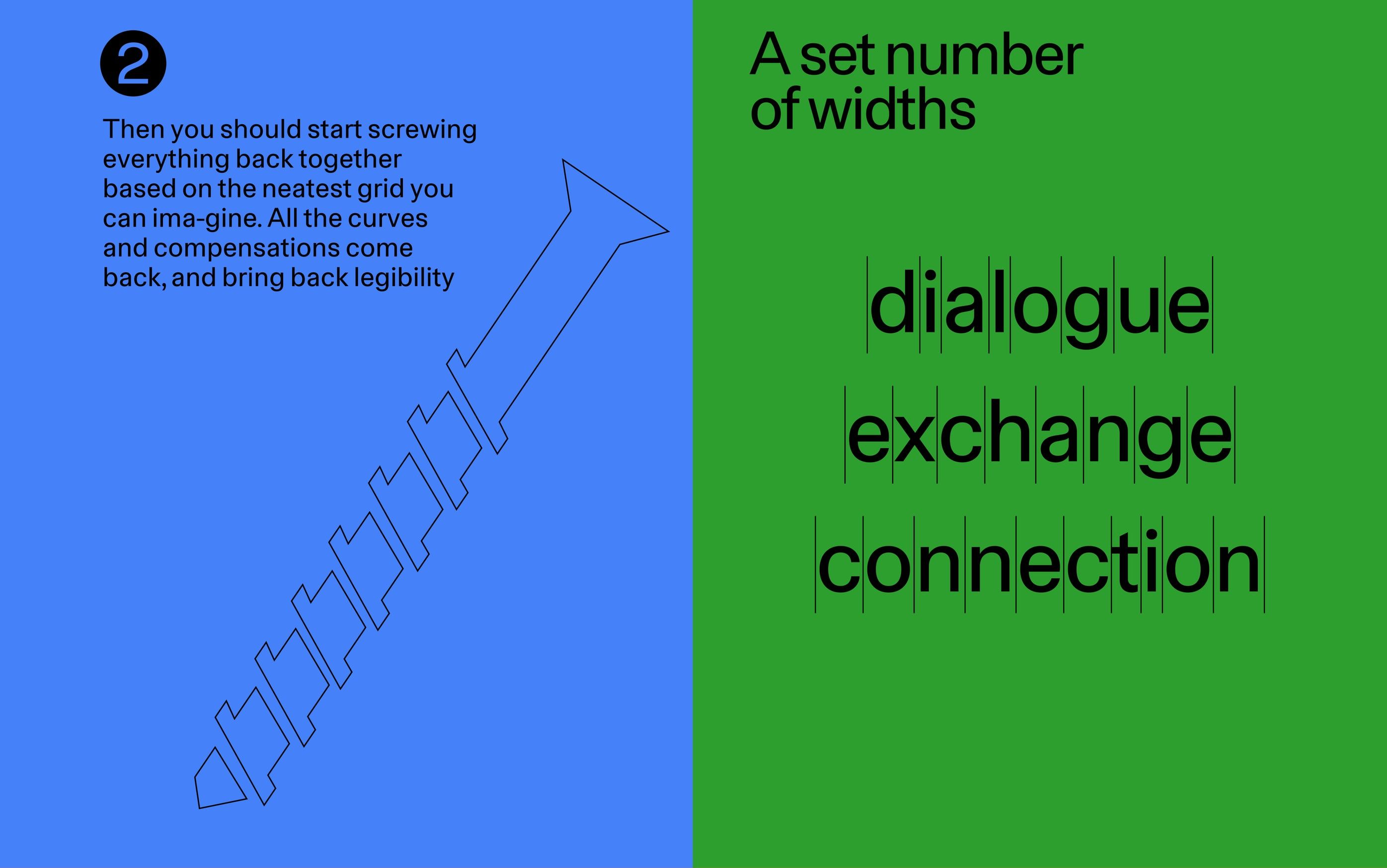
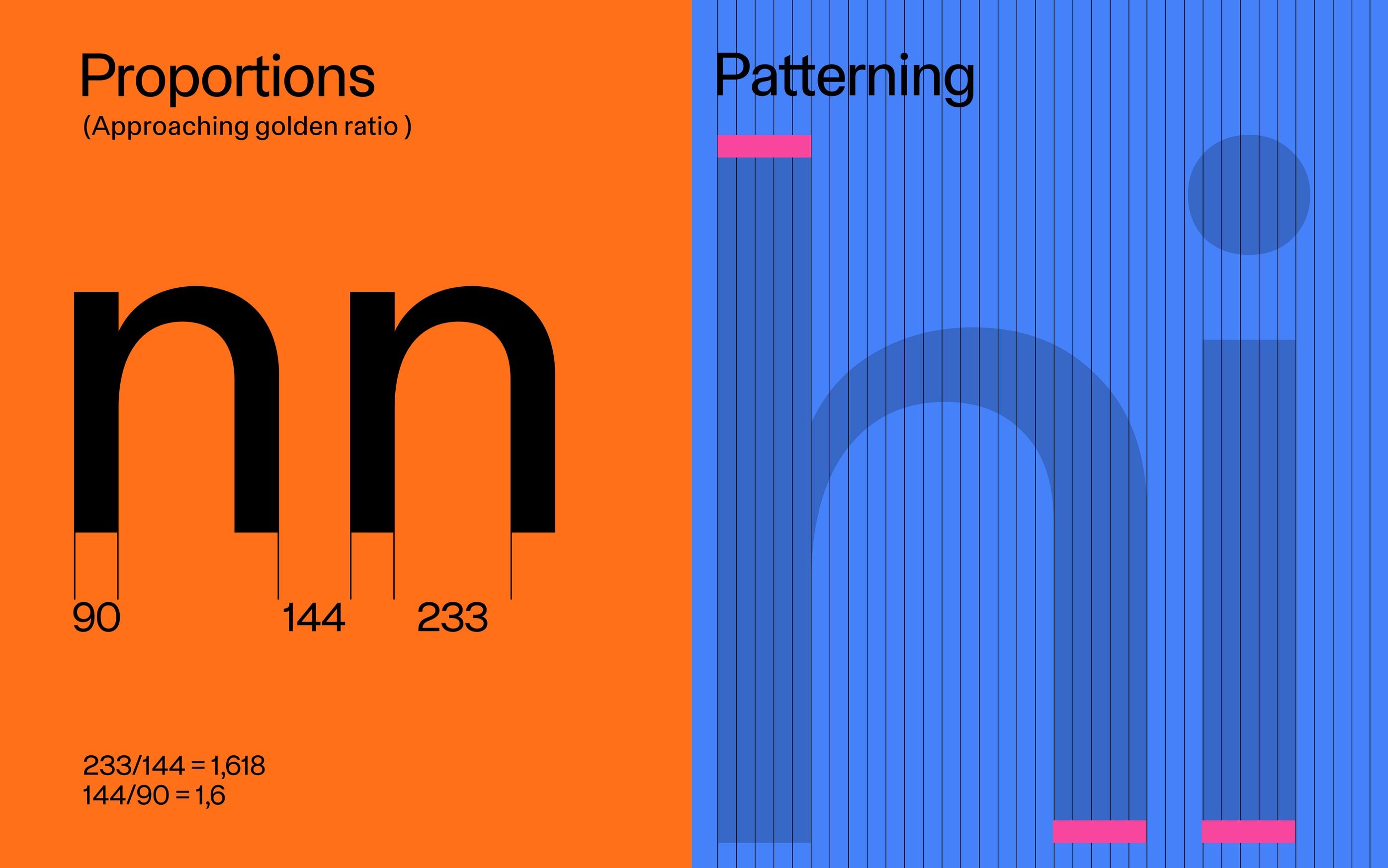
is a typeface that draws inspiration from frank e. blokland’s researchon the origin of patterning in movable latin type,which examines the structural logic underlying latin letterforms.rather than treating the grid as a compositional aid,the project adopts it as a generative system.every vertical stem is positioned on a fixed grid,establishing a consistent internal rhythm across the typeface.this constraint became the foundation of the design process,allowing pattern, proportion, and spacing to emergefrom a shared structural framework.the result is a typeface whose visual identity is shapednot by stylistic gesture, but by the systematic relationshipbetween its components.
credits
- type design
- Assylbek Umurzak
- case study
- Aisulu Shakenova